PANTONE released it's symbolic color selection for 2017: GREENERY. I am over the moon for this return to nature, robustness, and vitality. Leatrice Eiseman, Executive Director of the Pantone Color Institute, describes the color choice this way:
Greenery bursts forth in 2017 to provide us with the reassurance we yearn for amid a
tumultuous social and political environment. Satisfying our growing desire to rejuvenate
and revitalize, Greenery symbolizes the reconnection we seek with nature, one another
and a larger purpose.

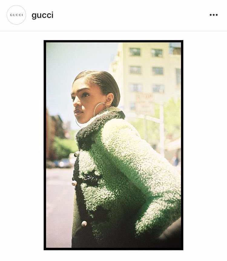
This color will find it's way into collections and product lines in fashion, architecture, plastics, graphic arts, home and interior design, and packaging alike. Get ready to see Kermit the Frog-like color everywhere you turn! I've already seen it in Gucci's Garden of Ninfa gift campaign, as well as their pre-fall '16 campaign; Chanel used greenery pattern play in their Spring/Summer 2017 presentation as well. The big questions you should be asking at this point: Why does PANTONE get to pick this color as THE color of the year, and why does everyone just agree to make it a focal point of their work? To answer these questions, we'll need to take a quick walk through history.


Here's the super quick skinny on PANTONE:
Back in 1963, a guy named Lawrence Herbert created a system to produce accurate color matches for communicating and producing graphic designs. He knew that color was seen differently by each person (think back to that blue/white dress phenomenon) and that properly communicating color choices on the spectrum could be problematic. Colors were named and assigned a number, and instructions on pigment mixing standards to achieve specific color were included. For example: tallulah faire blue is actually Pantone 3252 C. I can throw that color "name" out to my business card printer, a graphic designer, and a fibers specialist and I can be confident that tallulah will be the same color on my business cards, online, and on woven merchandise tags. Pantone's a beautiful thing for makers.
Over the next 40 years, PANTONE developed a name for trust and accuracy in manufacturing, design, paints, printing, textiles, and packaging. The company began to study how color affects emotions and physical reactions and shared that data with numerous industries, all of whom care about how their product color choices influence buying patterns. Enter the PANTONE VIEW Colour Planner which forecasts seasonal color inspiration up to 24 months in advance. This is where we get one answer for both questions. PANTONE performs tons of research and trend forecasting based on an infinite amount of current collections in fashion, home, architecture, photography, etc. and pinpoints color choices that are being used most often. It's not just one color, but several colors and the moods they create. Are there more earth tones or more pastel colors? Is the overall palette neutral or more primary in nature?

In other words, genuine artists are creating independently while PANTONE looks for similarities within their work to forecast to other creators what they can expect to be popular or trendy within the coming months. In this case, Greenery was the color that stuck out most. PANTONE sent this info to those who subscribe to the Colour Planner roughly a year ago, and then those creators focused their work around the color palettes provided, with greenery as a focal point. After all, why would they make a purple dress if all you'll be interested in buying is green?
So why does this matter to you? Before you start to recite Meryl Streep's famous line in The Devil Wears Prada about the color blue not being just blue, but cerulean blue, let me stop you. Don't rage against the fashion machine just yet -- I have two optimistic points to share as to why I'm OK with PANTONE being the god of colors.
First, it is genuinely comforting to know that trend forecasting is not comprised of 10 guys sitting in a room spinning a color wheel until it slowly stops on greenery. PANTONE's specialists truly ascertain the overall aesthetic of real artists' work across a broad spectrum of creative industries. Real, creative talent produces fresh ideas from the heart. They are not told what to make, they just make it. I love that the core of the decision-making process comes from artists and not editors; the fact that there always seems to be an underlying theme just reinforces the fact that we're all the culmination of our experiences. It seems like a ton of artists were looking for a fresh start this year, and aren't we all?
Secondly, it's totally fine if you hate bright green. You are lucky to live in a point in time where you can reject the norm and buy whatever dress you want. You don't have to buy Gucci if you don't want Gucci. You are no longer confined to Gayfers, Parisian, and The Gap. There are many talented independent makers who don't buy into Colour Planner simply because we don't care what the trends are -- we want to make what our hearts want to make. We're not confined to a business model that requires decision-making 18 months in advance, with hopes and prayers that the millions of dollars poured into a project produces results.
You can peruse thousands of brands at the click of a button, which means you can buck the bud green trend if you so choose. Shop local, scour Etsy, and find the outfits of your dreams! But just in case you're feeling a little too confident, oh militant you, let me leave you with one final thought: everything in Old Navy's new collection is comprised of PANTONE's Colors of the Year for 2012-2015. Every single thing. But hey, I won't tell if you won't tell.
